Sarah Woods Photography has Rebranded
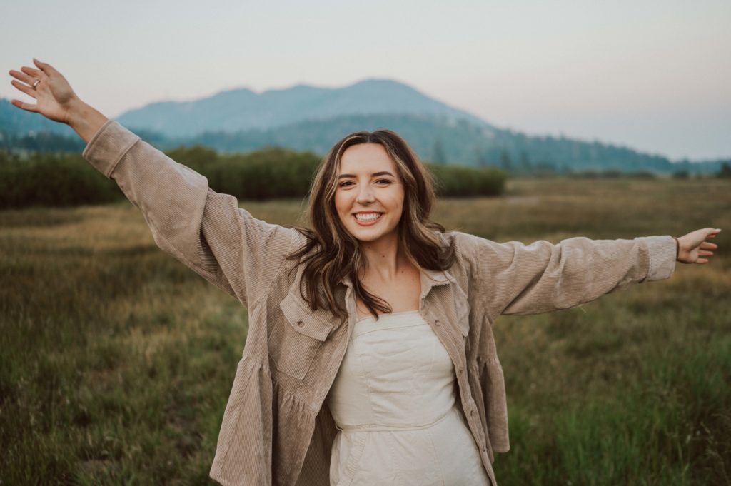
Hey there! I’m SO glad you’re here!
If you’re new around here, welcome to the rebrand of Sarah Woods Photography! My name is Sarah and I am your new fav professional third-wheel based out of coastal South Carolina. To my wonderful past & present clients, thank you for being here because I couldn’t have done this without you — I love you all!
I can’t believe the time has finally come! Over the past few months I have been working vigorously behind the scenes with the talented Alisabeth Designs on a complete REBRAND This change has been a long time coming and something I am super excited to share with you! My NEW WEBSITE is launching today, December 1st, 2022.
As with many things in life, my business has grown and evolved drastically over the past few years. With this growth came a much needed urge to refresh and reevaluate my brand image. Ultimately, I want my website to be reflective of my current work and the style of my current and future clients’ creative vision!
That being said, take a look at our new & improved logos + markings:


Rebrand Giveaway
Additionally, with the official launch of my rebrand, I am also announcing a GIVEAWAY that will include A FULL DAY OF WEDDING COVERAGE as a celebratory THANK YOU for following along and supporting my dream!


The giveaway will be held and announced on on my Instagram page. Be sure to follow along for more information, so you don’t miss any important updates!
Comment your favorite thing about the new rebrand below to be entered into the giveaway. Be sure to add your first name or Instagram handle, so that I can contact you if you’ve won!
Above all, I just want to give a huge thank you to all of my community for all of the love and support throughout the years! This wouldn’t be possible without all of your help!
Finally, I wish for the best of luck to all giveaway entries!
Be sure to check out the rest of the new website.
Click here to be directed to the home page
December 1, 2022
Love love love the darker forest-y colors!!! Such a vibe for sarah WOODS photography ♥️♥️♥️ look out South Carolina, SWP is coming to town!!!
LOVE the darker moody vibe of the rebrand! Exactly what I am looking for in a wedding photographer!🤍
I loveee this! Shows so much personality and feels so welcoming!
Love how beautiful each picture is in the re brand ! Love the vibe on the whole site !
I love how modern and sleek everything looks! It answers any question I could possibly have!! Your work is stunning! I’m sooo excited for you!
LOVE the font!! I personally feel like fonts give off the main vibe and then you work the colors around that and the vibes overall are stun.ning. So well done!
Absolutely LOVE the earth tone colors!! So perfect for a world traveler like yourself! So excited for you and Cody to get to move to South Carolina EEEEE!!!!! Can’t wait to keep following along with you on all of your adventures!!!!!
LOVE THE VIBE OF YOUR PAGE AND THAT IS SO INFORMATIONAL & EASY TO NAVIGATE!
New here but I do love the font you chose!
Your new website is AWESOME!! There are so many beautiful pictures and it’s stocked full with other helpful content. I LOVE the new branding! Very professional and sophisticated. You clearly LOVE what you do!!
This is incredible to see your website reflect you and your growth as an artist and a professional. Truly represents who you are and the quality your couples can expect! Love, love, love it!!
Honestly it all looks incredible, but a special shout out to the black and white photos throughout!! I adore the vibe they bring! @sarmckenziee
The website describes the amazing work you do! It is so easy to know and trust that you will be getting amazing pictures. Very well made!!
I’m obsessed with the top of each page with the moving pictures and typed out words! So cool. Also love the shape of the photos throughout each page and the way they overlap. Congrats!!
@shannonglass06
I love the clean minimal look! It’s so classy yet modern.
Love the whole website. The new logos are clean and modern but show your personality which is so important when choosing a photographer! I also love the combination of still shots and rotating images throughout the site. Really beautifully done! @maddiekjewell
Love the vibe & clean look of your page! Modern & moody. Beautifully done! @itsjuststeph
I love how vibey and down to earth it all is. Seriously, great job!!
Omg !! Obsessed with this whole website. Love the fonts, love the dark but neutral colors being combined ! You can tell you poured your heart , soul and time into this ! Which absolutely lets me know how much you love what you do ! Which is why we would love you as our photographer!
I looove the color and simplicity of the rebrand!! Your vibe is everything I’d want as a photographer. But we also loved you from our brother’s, taylor & lexus, wedding!!💕
Love the color scheme – it gives such a nature-y & natural feel!
WOW your rebrand just works so seamlessly together!! The moving pictures throughout the website really bring me into the photoshoot, but I think my favorite part of the rebrand has to be new logos! They are professional and artistic just like your photography <3 It puts your personal touch anywhere!
Such a pretty site, the layout and palette are beautiful! You need to show me how to make those awesome gifs!
The website is very cohesive. Easy to get around and see all the information. You get a true sense of the amazing experience it must be to have you as a photographer.
I love that you added a GIF as a profile pic! I haven’t seen another photographer do that as of yet. So cute!
I love that your rebrand shows exactly who you are as a photographer & what you have to offer! At first glance clients are able to get a feel for your “vibe” & it allows for an instant “click” Loving it & wishing you all the best!
THE COLOR PALETTE!! So into the moody greens
I love the typography on your new logos!
I love distinctive this new rebrand is! With the new logos it’ll be so easy to spot one of your gorgeous photos so easily! Professional and playful like your photography! I can’t wait to see this journey take you to new heights!
I love love love your colors! I am a sucker for greens! You poured your heart and soul into this and it shows!
I’m digging it! The website fits your art and, aside from being easy to navigate, the fonts and feel are on point.
I am really loving how things move! It’s like it’s alive 🙂 I enjoy how much of your art is on every page. You and your team did a fabulous job!
I love all the deep forest greens and the new SW logo is clean! And classy! Love itttt